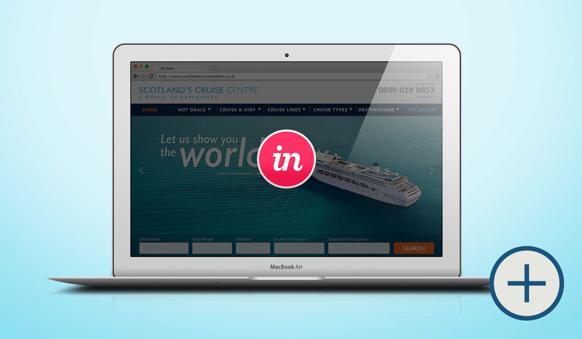
Let’s start by having a general overview of the actual website: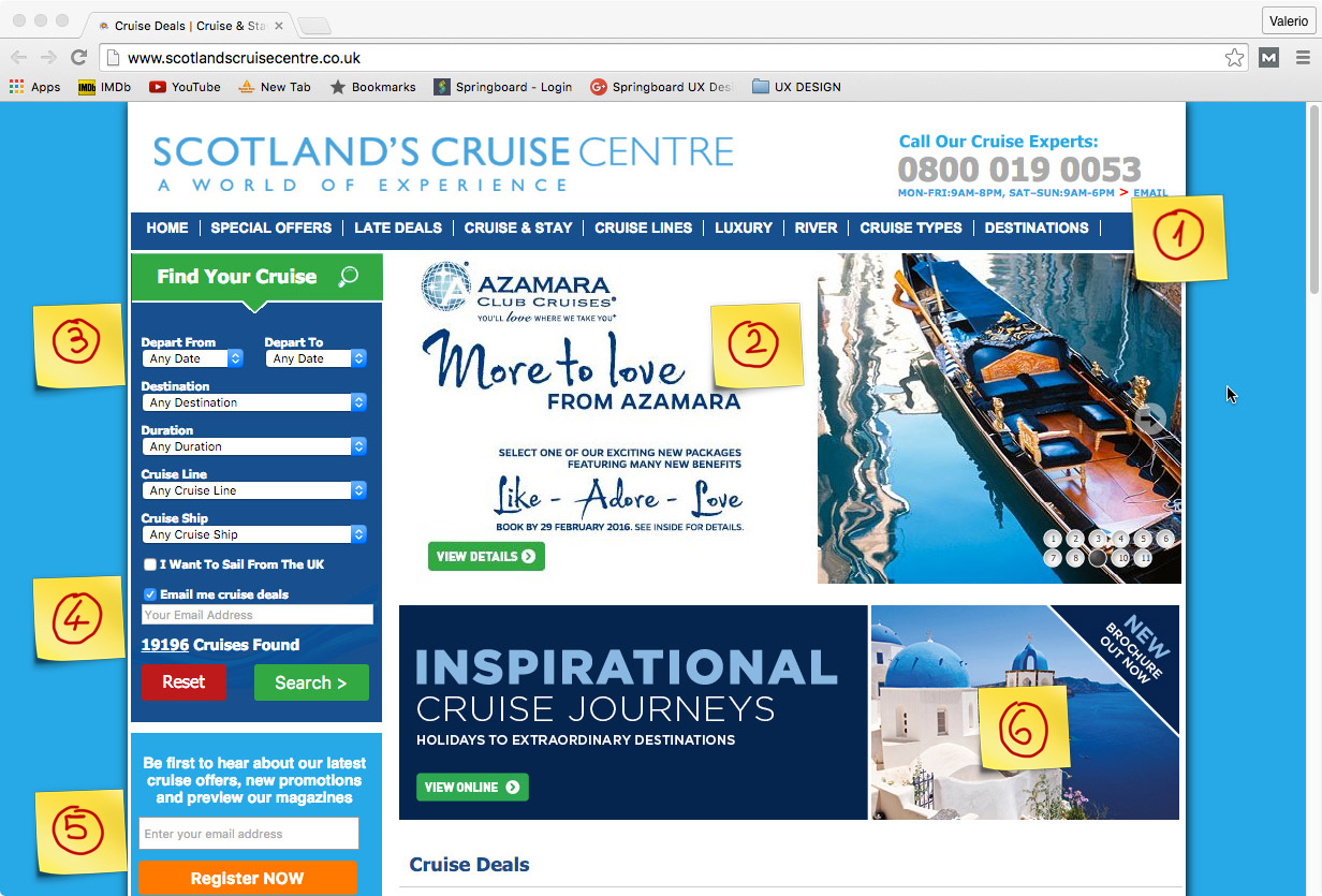 Notes:
1 - Revise the main navigation menu with new Information Architecture after user tests. The main slideshow can be full width and visually cleaner.
2 - Too much text accompanying images.
3 - Search Layout not very appealing. Research current visual trends to maximize conversion.
4/5 - Two different email address fields can be a bit confusing. Register and login actions can be prompted in a tidier layout page and probably follow a lazy registration practice.
6 - Avoid too many special offer ads on main page to reduce visual clutter. Furthermore: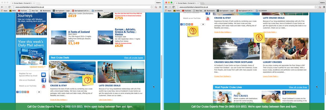 7/8 - There are too many deals listed, my impression is that users feel already overwhelmed on the landing page. Perhaps these offers could be condensed and made expandable to view more if needed. 9 - Social Icons to be regrouped with contact information on footer menu.
Results Page:
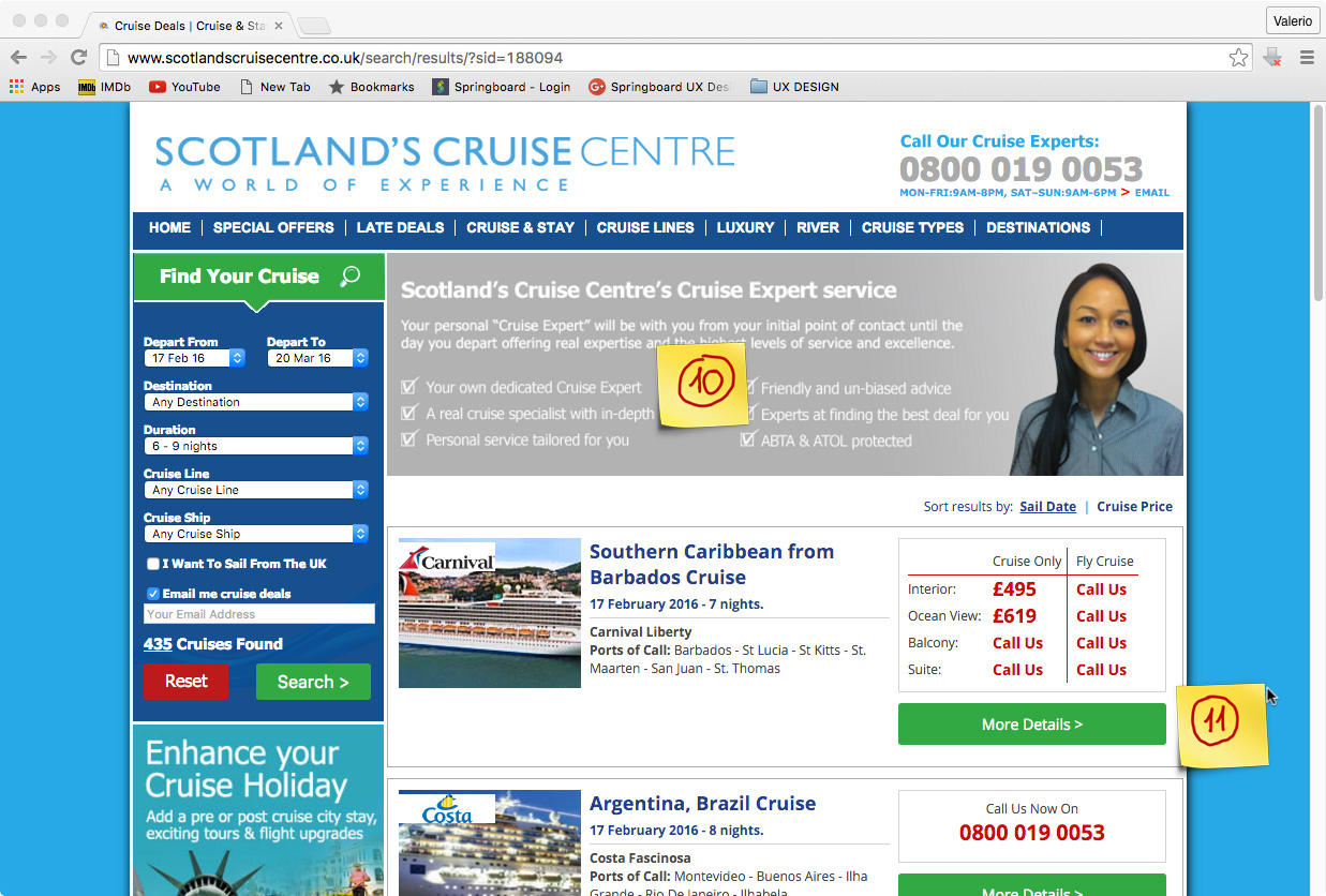
10- No need for redundant info here.
11- The user does not have any option to book, nor to “save” this cruise option for future retrieval, and further comparisons, this would be quite useful to narrow down the search, especially in case of long lists.
Observations:
In my opinion the website would benefit from some redesign exercise, especially from the informational architecture standpoint: the interface looks messy, It carries too much information and it doesn’t seem organized with strong hierarchy. I also think having too many choices presented in this way might lead to poor conversion.
Right now, there is too much text on the landing page and I think this doesn’t convey the glamour aspect of a cruise, which ultimately is what the site is trying to sell. Moreover the site is not responsive.
For this project I will try to follow most of the ”7 Principles Of a Great User Experience” highlighted by Susan Weinschenk:
- Match the expectations of your target audience
with a simpler and leaner interface, the users will get their info easily - Don’t make people think too much
by removing some clutter, the interactions should become quicker and more intuitive - Meet the goals organization
achieving both UG1 And UG2 will definitely help getting more conversions - Minimize errors
- Design a satisfying and pleasant user experience
Clearly stated on point 1 above - Person can fulfill intended goals
Reference above to points 1 and 2 - The experience of the human trumps everything else
With a fresher and more intuitive interface the experience of booking should become more pleasant
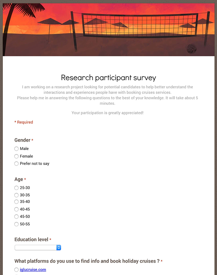
Given the multitude of offers available on the market today, I chose to use an ethnographic approach in order to find out the different attitudes in booking expensive holidays. Initially, I posted a preliminary survey to 3 different cruises web forums in order to recruit and screen users for interviews:
- – http://boards.cruisecritic.com
- – http://cruiseline.com/forum
- – http://www.fodors.com/community/cruises/
Survey
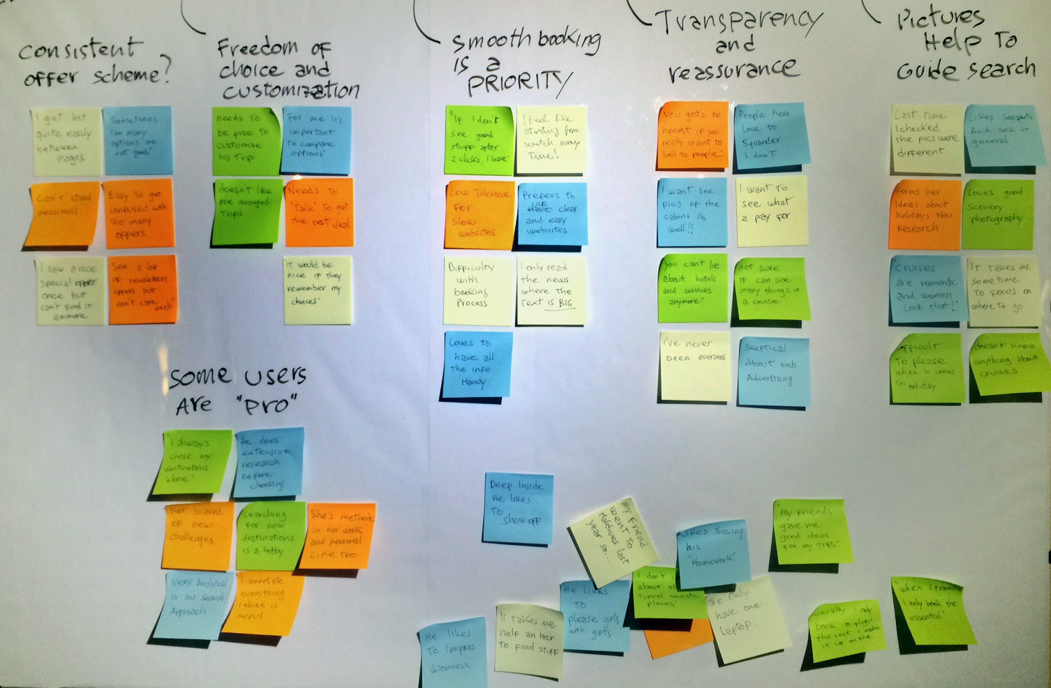
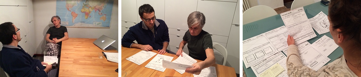
I then proceeded with some interviews to further investigate user goals, behaviors, attitudes and pain points.
Some user quotes revealed a certain level of frustration:
“I feel always like starting from scratch…”
“Every time I feel overwhelmed by so many choices”
“I don’t know how and where to start”
“Sometimes I keep browsing but I get distracted and end up to not choosing anything…”
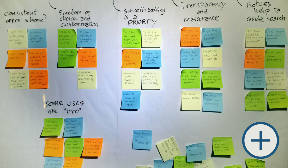
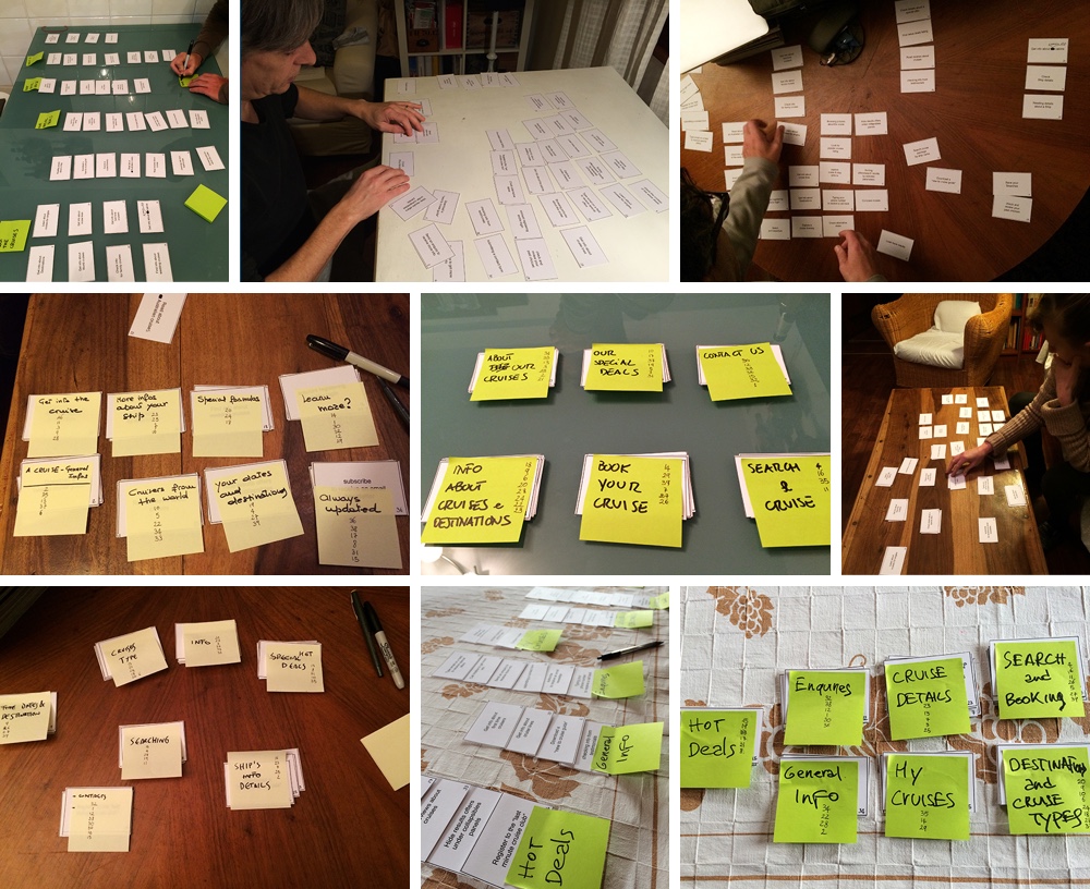
Affinity Map
After reviewing all my notes and interview recordings, I proceeded creating an affinity map that allowed me to reveal some useful patterns and later, insights, to develop possible features.
 By putting together the insights from the affinity map and the previous actual site overview, a group of possible features started to appear:
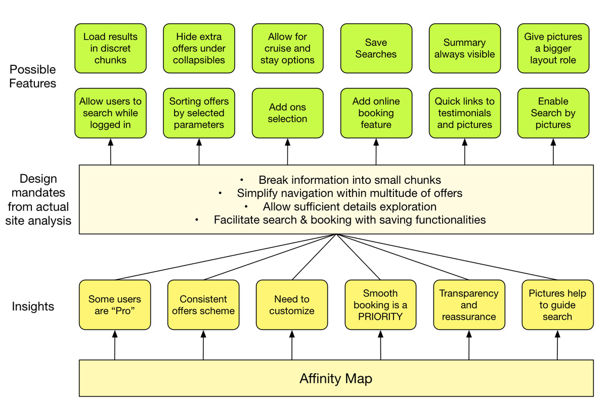 Before proceeding with a comparative analysis and a subsequent proper features list I also created users personas by condensing all the insights and notes from the interviews
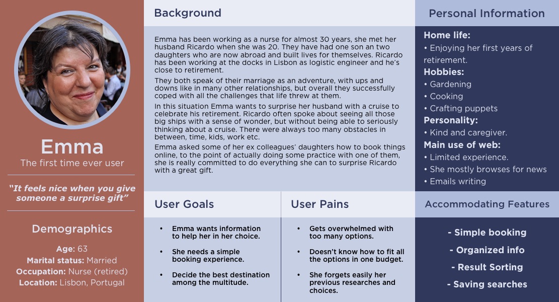
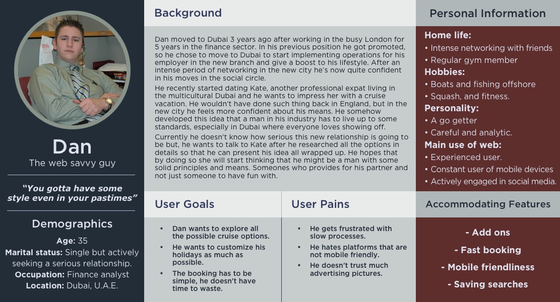
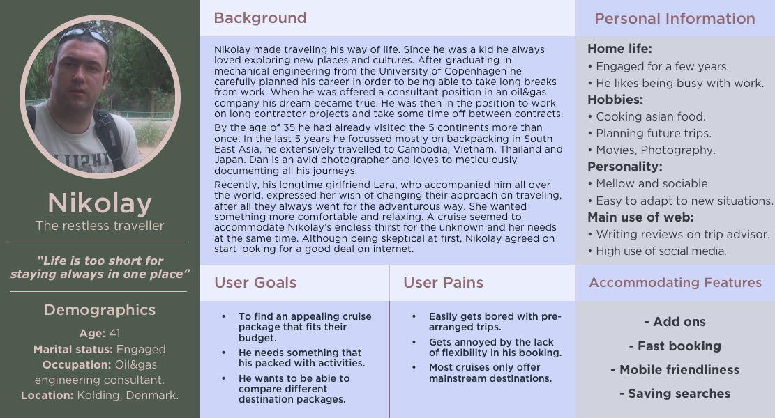
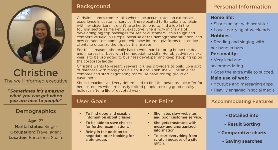
Personas
For the sake of simplicity and to reduce the scope of work for such massive website, I will derive a single task for each persona in order to guide design and prototype decision. However, It is necessary to proceed with the comparative analysis first.
Competitive and Comparative Analysis
After a quick research on semrush.com I identified two main competitors for the european markets to which I also added cruise.com for the relevance of the organic results for the cruises keyword.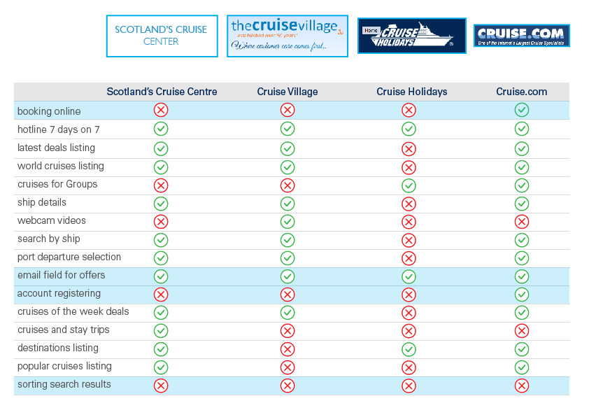 It is interesting to notice that the direct online booking feature is missing among the competitors with the only exception of cruise.com which is not a direct competitor in Europe. Other features that resonated in the comparison, with a potential to increase competitive advantage include:
- – a different and more “organic use” of the email field
- – account registering
- – sorting search results
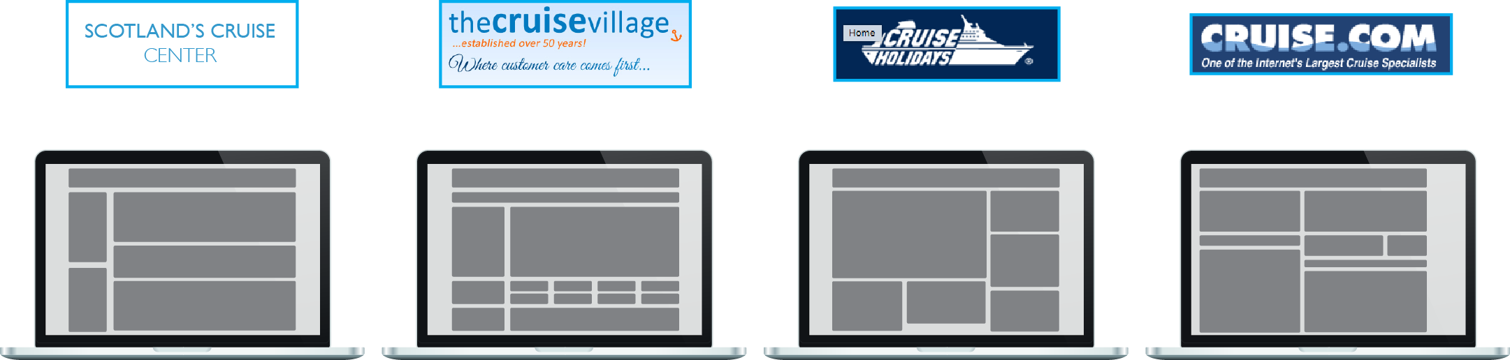 Layout organization generally presented the same problems across all the websites. These cruise portals all look a bit outdated and they tend to show very dense information on the home page mainly with small links and several offers. Moreover, none of these sites is responsive so definitely not mobile friendly.
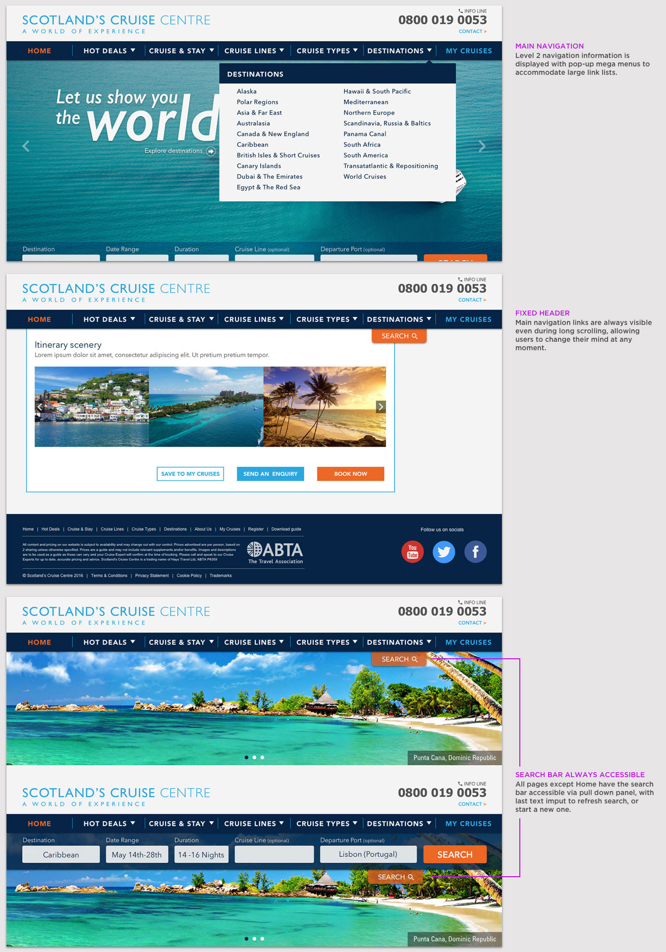
Design Implications: because of these considerations, it would be wise to reorganize all the amount of information in smaller and more digestiblechunks, especially through the use of mega-menus and a revised Information Architecture. In addition to this, I will also explore some solutions for a minimum viable product responsive mobile version of the website.
Features
After reviewing the competitive analysis, considering points related to the booking experience of the personas, the affinity map, pleasures and pains from the interviewees, I derived a list of features which I later categorized using the MoSCoW method; this bring me to the next step of feature prioritization.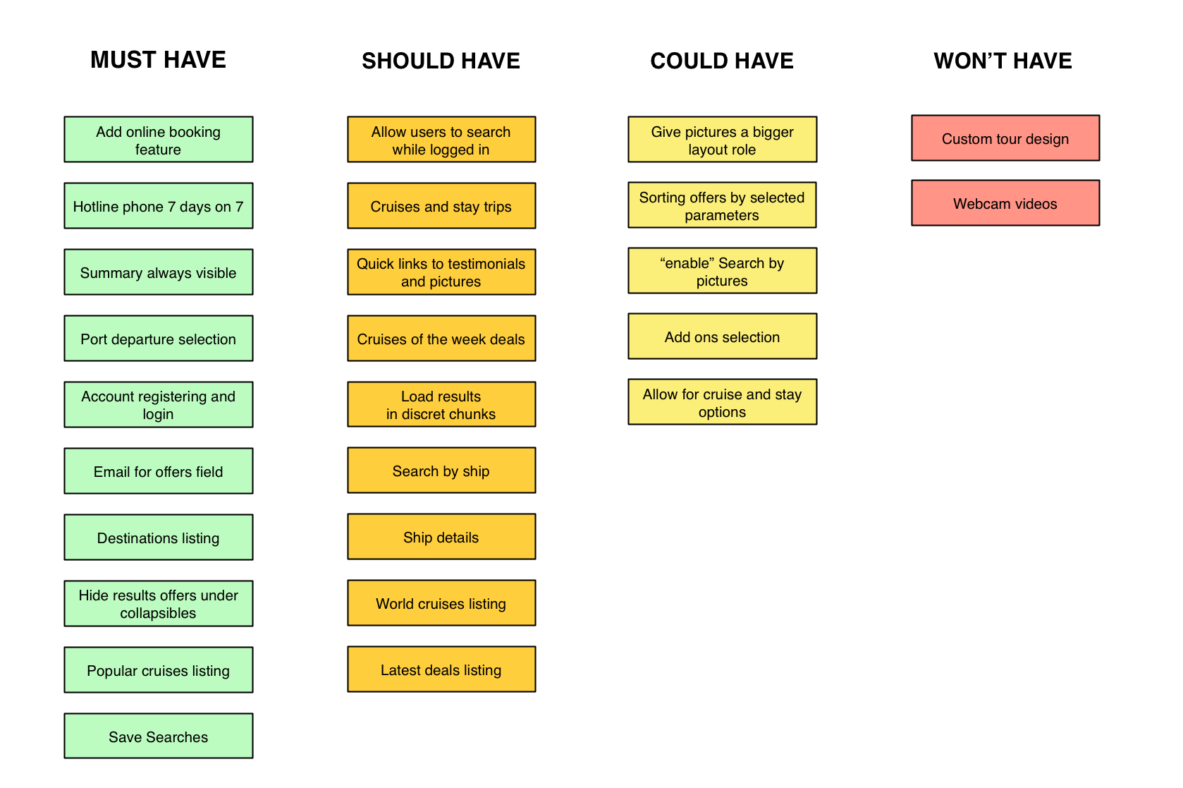
- – The first feature that couldn’t have left behind was the booking online itself. As previously mentioned Scotland’s Cruise Centre still lacks of this main capability, therefore a must to have in order to clearly position the web site ahead of competition.
- – Similar considerations led to include a client area, accessible via login and sign up features — but with a lazy registration model to avoid user annoyance — where the user could save and check past viewed cruises and options.
- – Under “Should have”, I included the option for the users to load search results in discreet chunks. By doing this, the user doesn’t get overwhelmed by the amount of results so that more attention can be payed to every single cruise option and hopefully maximize conversion.
- – Searching cruise by pictures it’s something that I’d have loved discussing with the engineering and marketing team. Implementing new search features, might be a strategy to become more competitive in future developments of the web site, since no cruise portal is currently offering anything like that.
For the sake of simplification I refrain from digging further into a road map of features introduction, rest assured that the new design will include all the must and should have features, leaving the remaining ones for future development and testing.
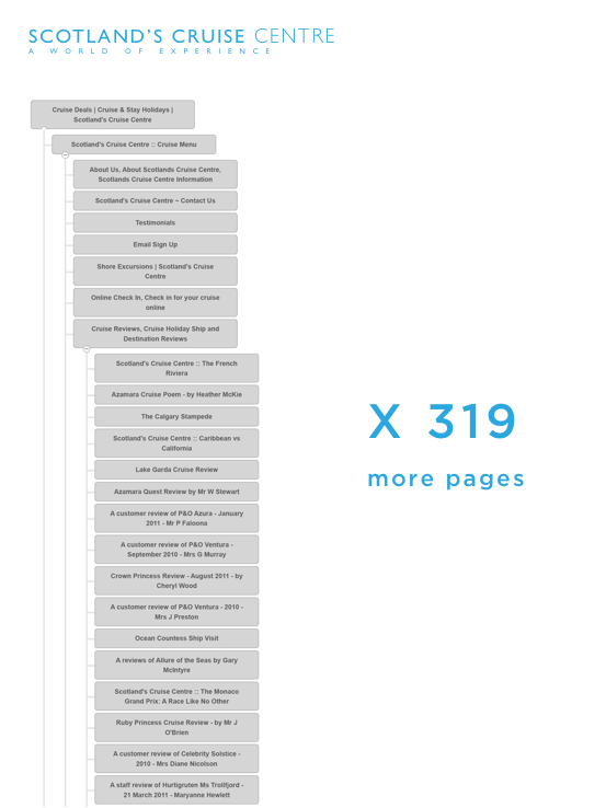
After studying the actual Scotland’s Cruise Centre site map, it was quickly noticed that the number of pages grew out of control, disrupting the hierarchy of the website itself. As a consequence, and noted earlier in the observations, the design seemed affected by what Jared Spool called unintentional design: the result of designing from the back-end prospective, for the only purpose to serve the database that kept growing out of scale.
To support such considerations I included screenshots of the actual site map scheme generated via Slickplan software, a total of:
500+ pages, 7 broken links, and 43 duplicated URL pages.
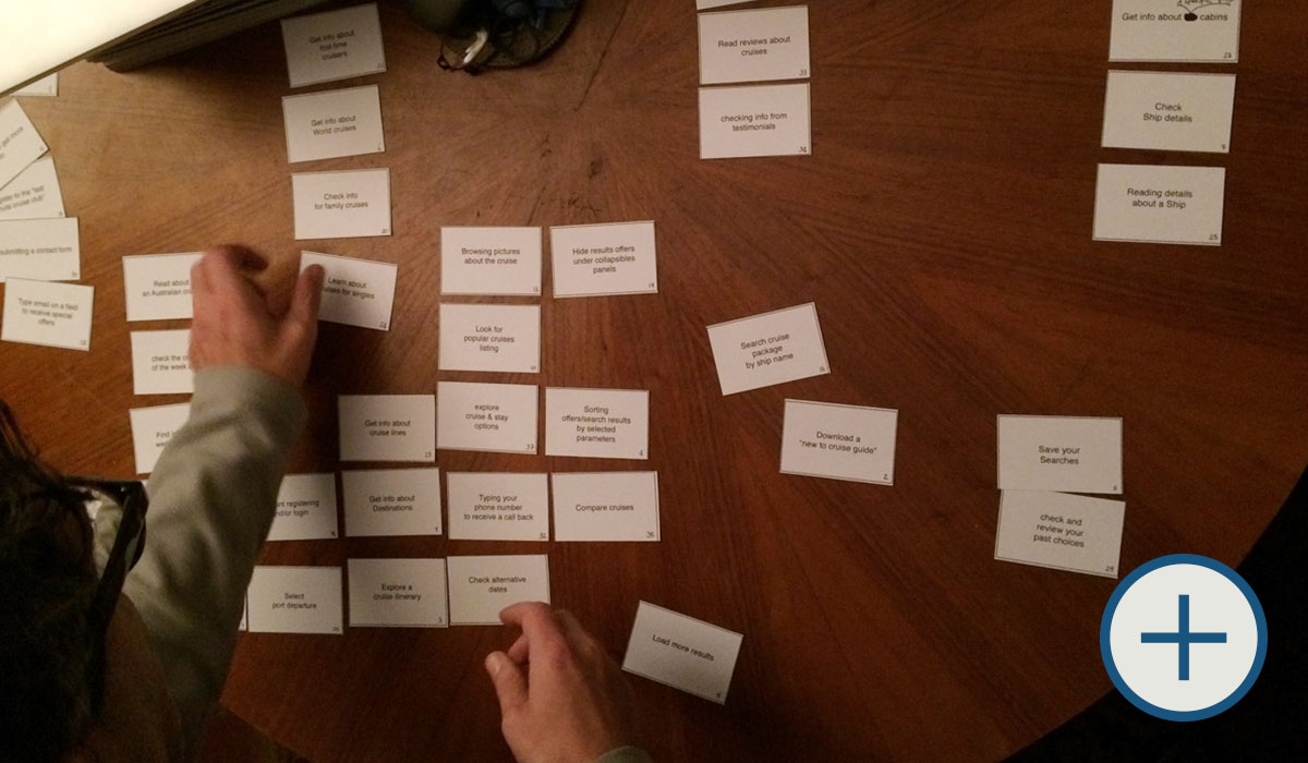
I then ran a few sorting sessions with users:
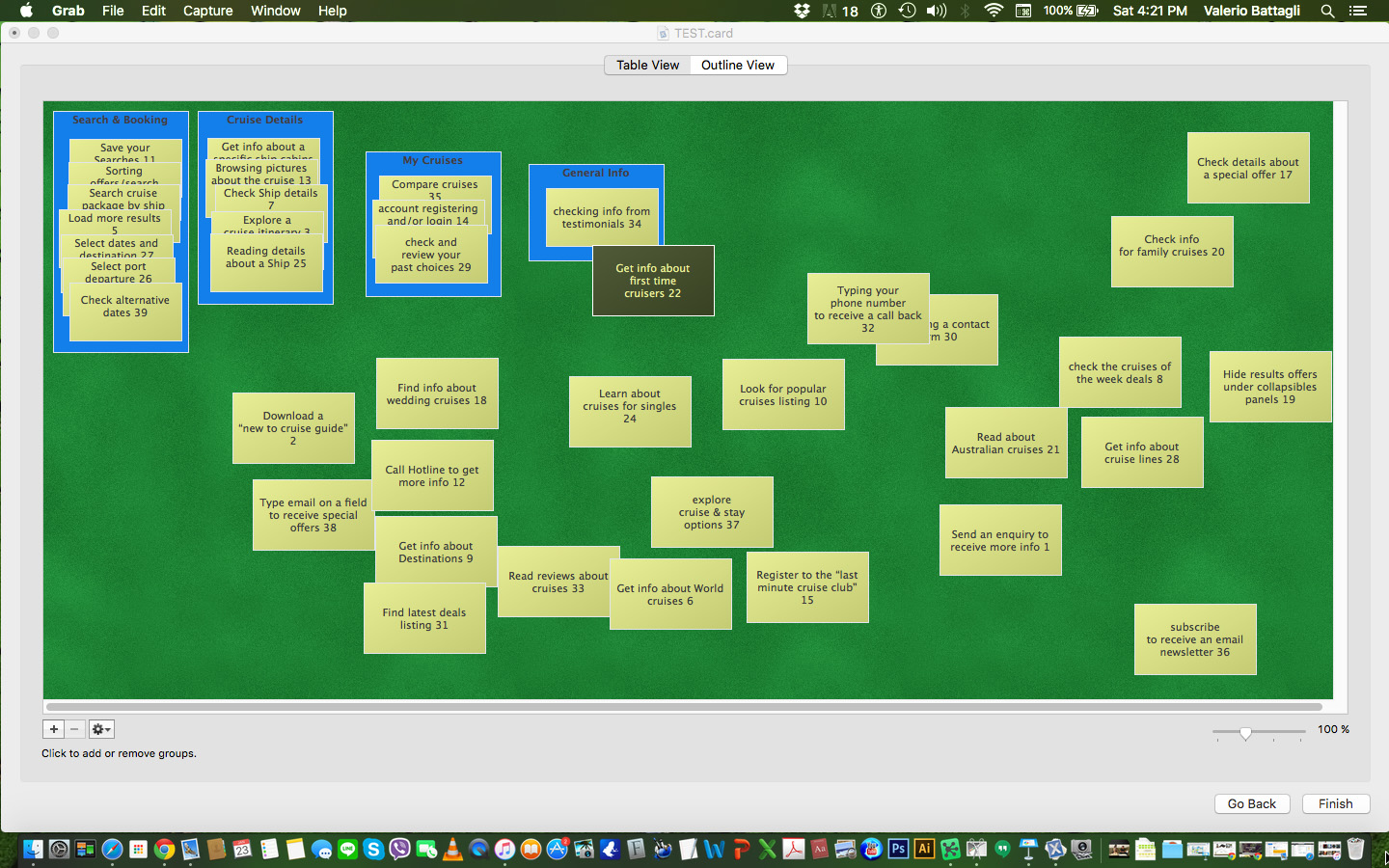
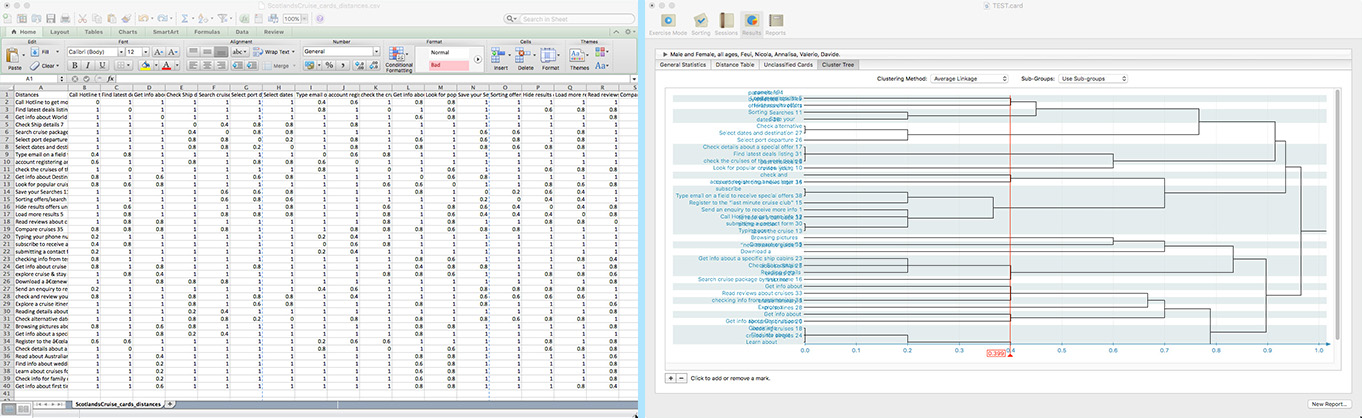
In general it seemed that the actual information architecture could benefit from a revised taxonomy in order to group similar pages content together, and avoid duplicates.
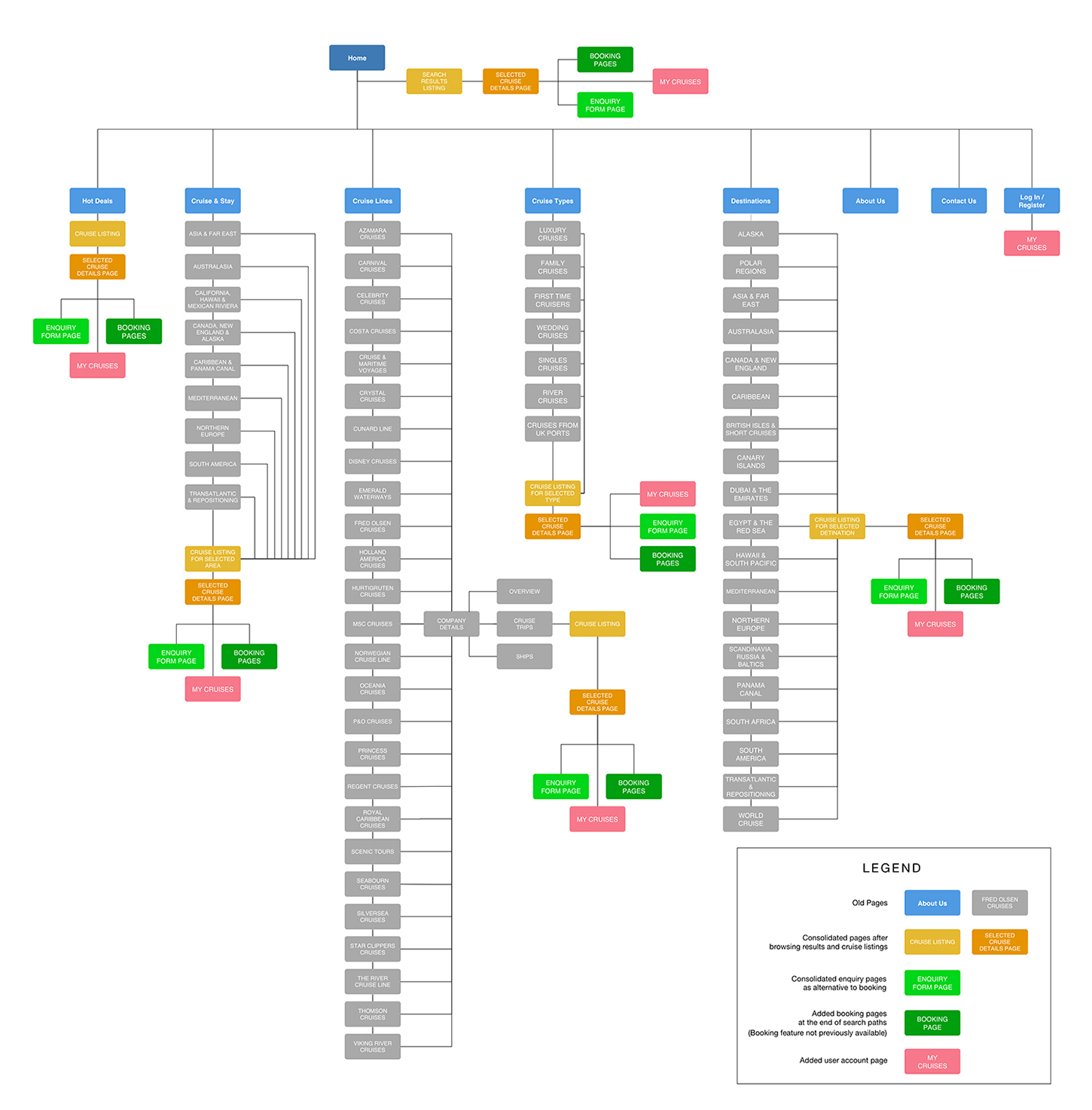
Combining the insights from card sorting and the persona accommodating features, a new, simplified, sitemap was born:
(open in a new tab for full view)
Lets now have a look at our persona scenarios, tasks and relative task flows. To simplify, I only created flows for the two main users identified earlier (Personas Emma and Dan), also because Nikolay and Christine would have performed very similar tasks to the one carried over by Dan, (browsing options and save for later).
Emma’s Scenario and task flow
Scenario: Emma is at her daughter’s friend place, she has been showed the Scotlandscruisecentre.co.uk website as possible platform where perform her research and eventually her booking.
User Goal: “My husband has been dreaming about a cruise to the Caribbean. I want to see what the options fitting my budget are, and then book a cruise for us for 2 weeks, so I can surprise him with a gift.”
Entry Point: Home page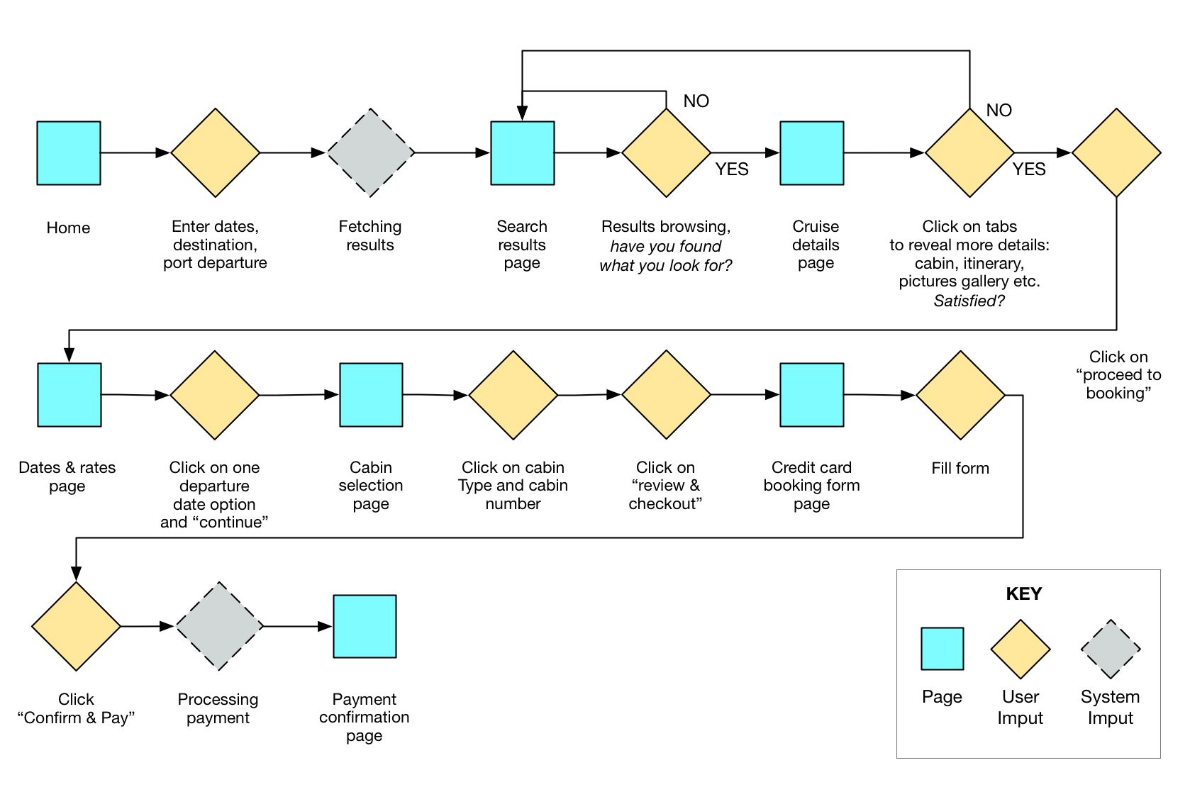
Dan’s Scenario and task flow
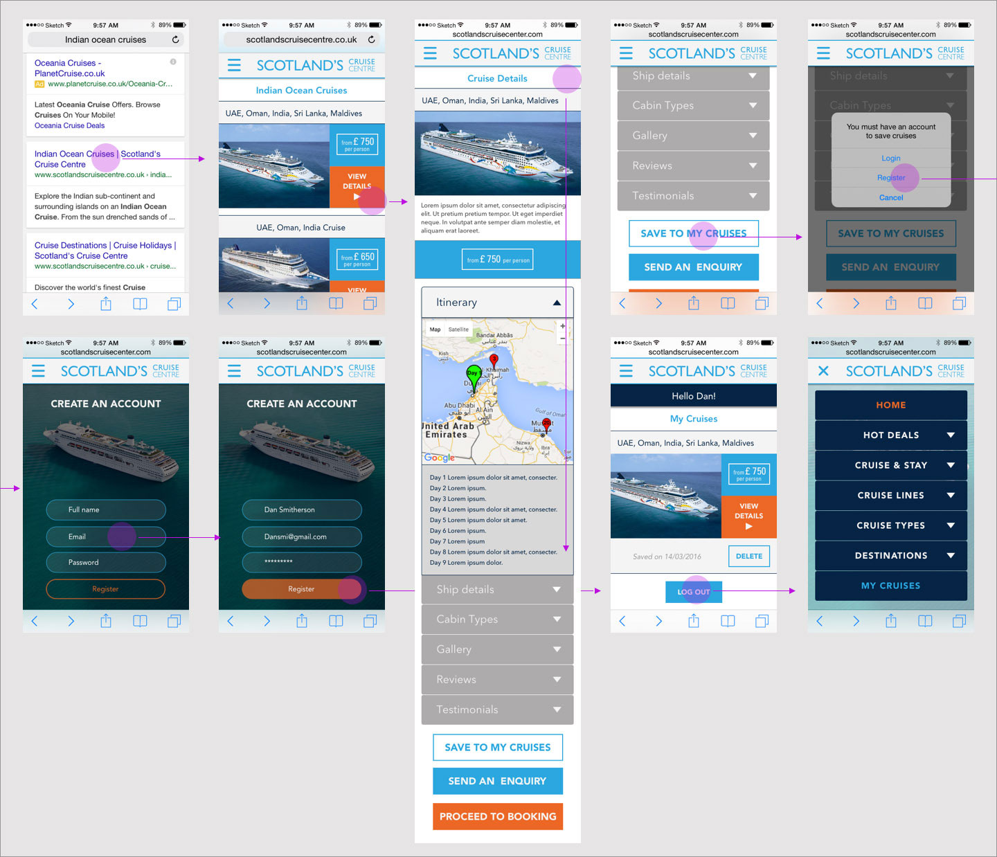
Scenario: Dan is on the move to a meeting, while using his phone in the cab, he’s browsing some “Indian Ocean Cruises” results on Google search. Redirected to a Scotlandscruisecentre.co.uk page link, he wants to select one package that seems interesting and save it, so that he can further examine it later on his laptop.
User goal: “I wanna have a look at what the price range for a week cruise in the Indian Ocean is, so I can start planning a proper one eventually.”
Entry Point: Page results for Indian Ocean cruises keywords from Google Search.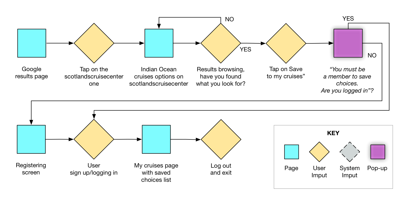
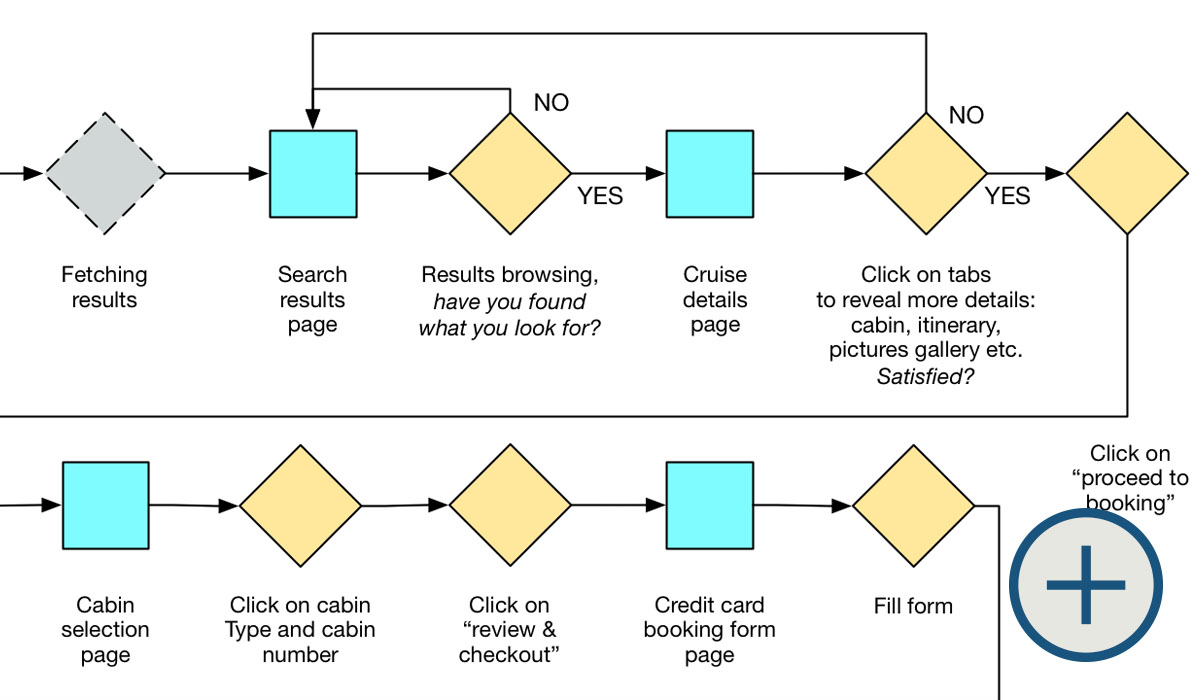
Keeping in mind to simplify the overall look of the website and identified the main task to prototype, I then created some paper wireframes for booking a cruise to the Caribbean.
Paper wireframes and prototype
(open in a new tab for full view)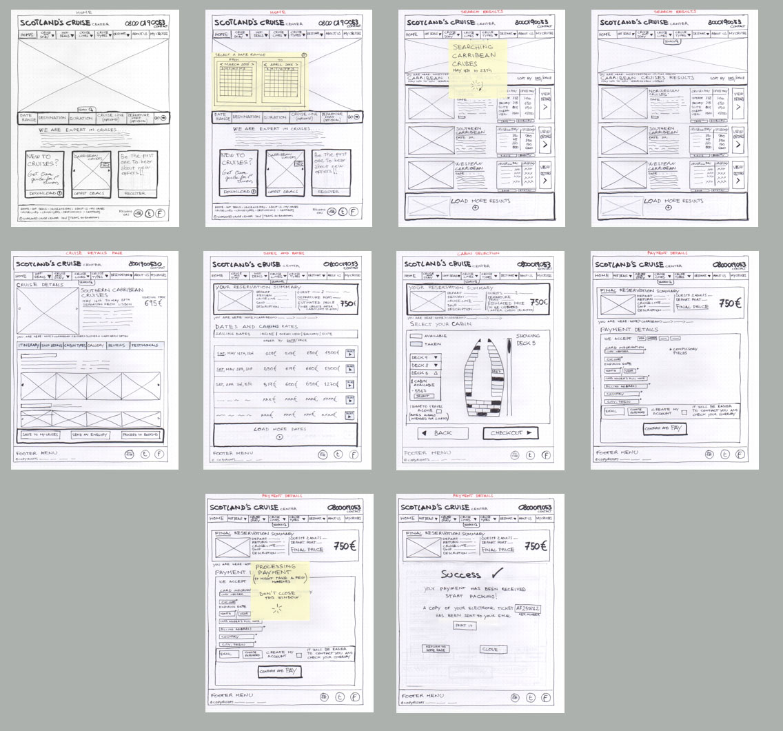
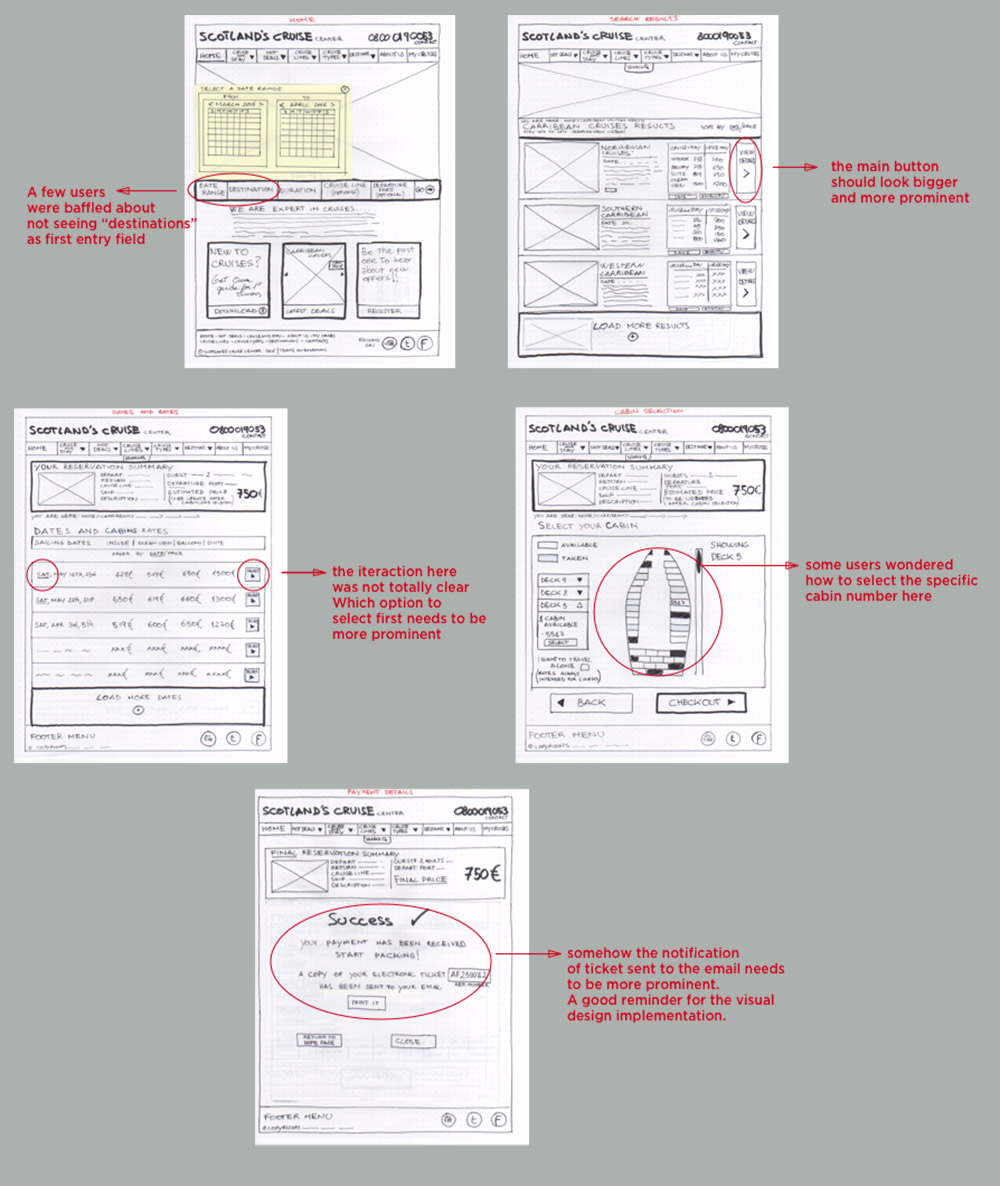
Insights: Users appreciated the minimalistic design compared to most of the holidays portals where they are usually overwhelmed by tons of various offers and clickable areas. However the search bar seemed not clear enough in terms of fields order. In addition the rate and cabin selection process needed to be clearer.
Design Implications: the high fidelity version will need to take into account those frictions revealed during user testing. In particular:
- The main selection on the cruise listing page needs to be more prominent.
- The rate and cabin selection needs to be more intuitive.
- The payment feedback has to be simpler and more thorough.
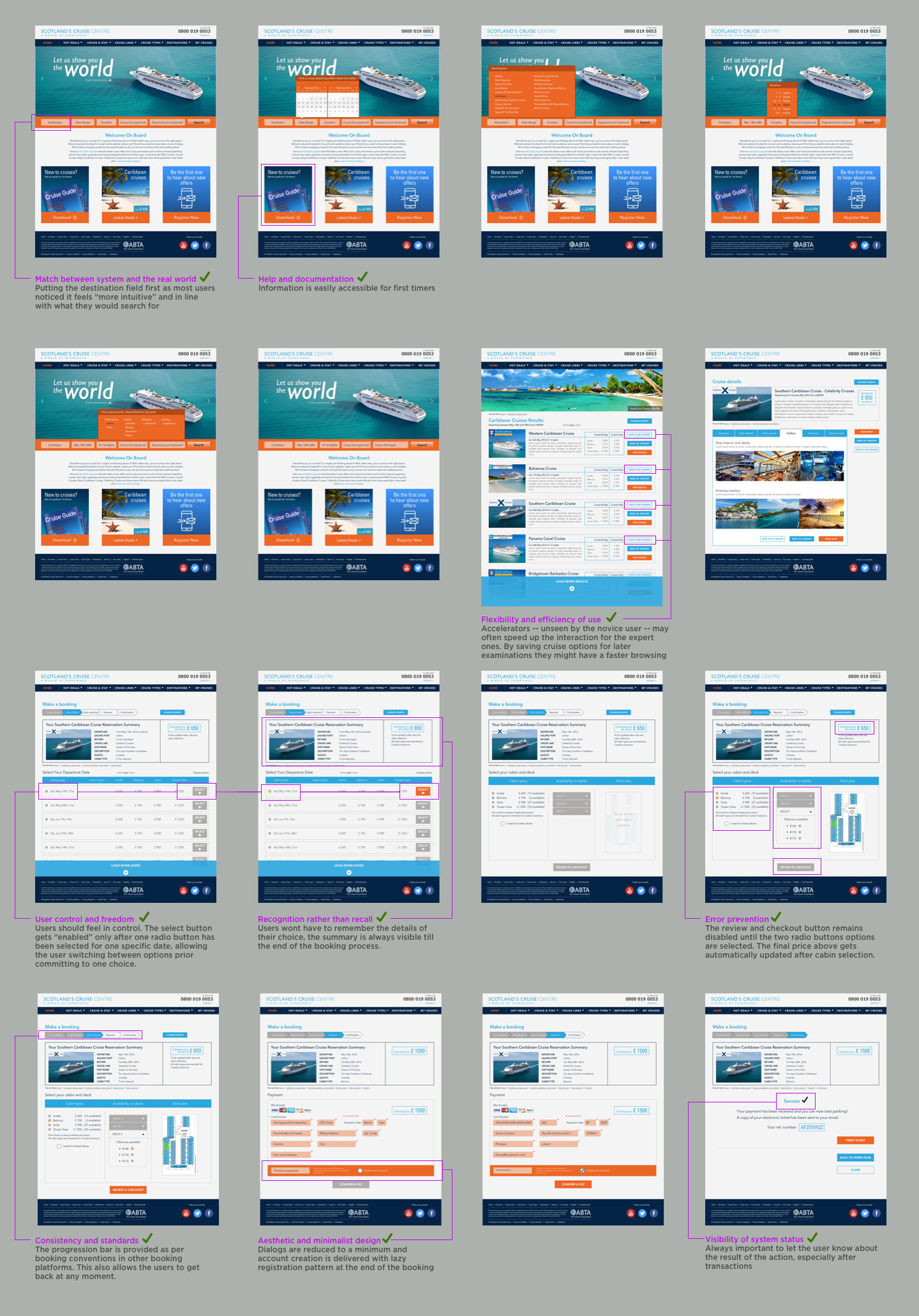
High Fidelity Screens and Heuristic Evaluation
From the insights collected during the iterations with the paper prototype, I created the first version of high fidelity screens trying to keep the layout as simplest as possible and following the 10 Usability Heuristics for User Interface Design by Jakob Nielsen:
Iterations
After uploading the first version high fidelity screens on inVision, I proceeded with some user tests, asking the participants to act as per Persona Emma, by search and book a cruise on the Caribbean.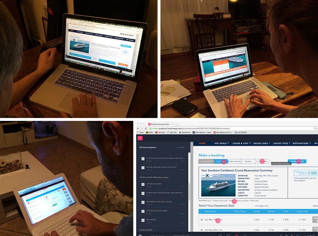
Most users found interacting with the pop up menus in the search bar intuitive and simple, the rest of the prototype experience was generally reported as easy to browse. However after two rounds of interactions a few interaction notes were collected:
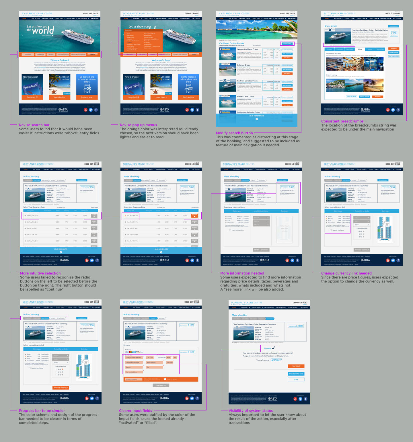
After incorporating all the changes from the usability tests rounds, I created the final version of the screens for the booking task:
(open in a new tab for full view)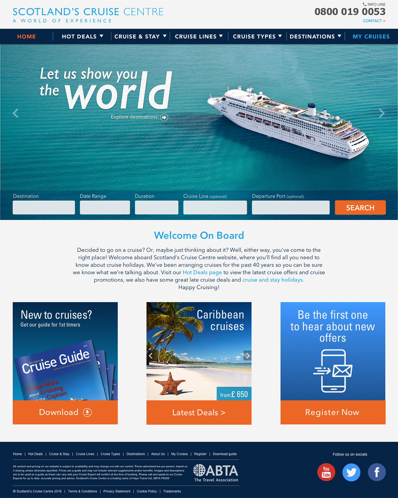
(open in a new tab for full view)
 (open in a new tab for full view)
I later uploaded all the screens in InVision for the this clickable prototype:
Minimum viable product for mobile version
As previously mentioned, the Persona Dan needed a mobile version of the site to save a cruise option for later retrieval. I therefore designed a few screens for the mobile version to accommodate Dan’s task in this storyboard:
Future Steps
I believe that for travel portals of this kind, the backend development usually plays a key role in usability. In particular, having to deal with content heavy information like the cruise business, forces to carefully choose which and how much information to show without overwhelming the user.
For these consideration I would:
- Plan and execute a few A/B or multiple testing to establish the right amount of info and database filtering optimization.
- Think about how new features will be developed to increase competitive advantage, like establishing smart parameters to compare different cruises, enabling search by pictures location, and so on.
Learnings
In conclusion, I think the core segments for this particular kind of trips are still seniors who can afford luxurious and relatively passive holidays. In my opinion, any future development of this website should take this aspect into account.
These considerations informed the user experience design all way through. For this project, it’s been interesting designing and simplifying all those aspects we normally take for granted on a page, after all, bigger text is good to have sometimes!