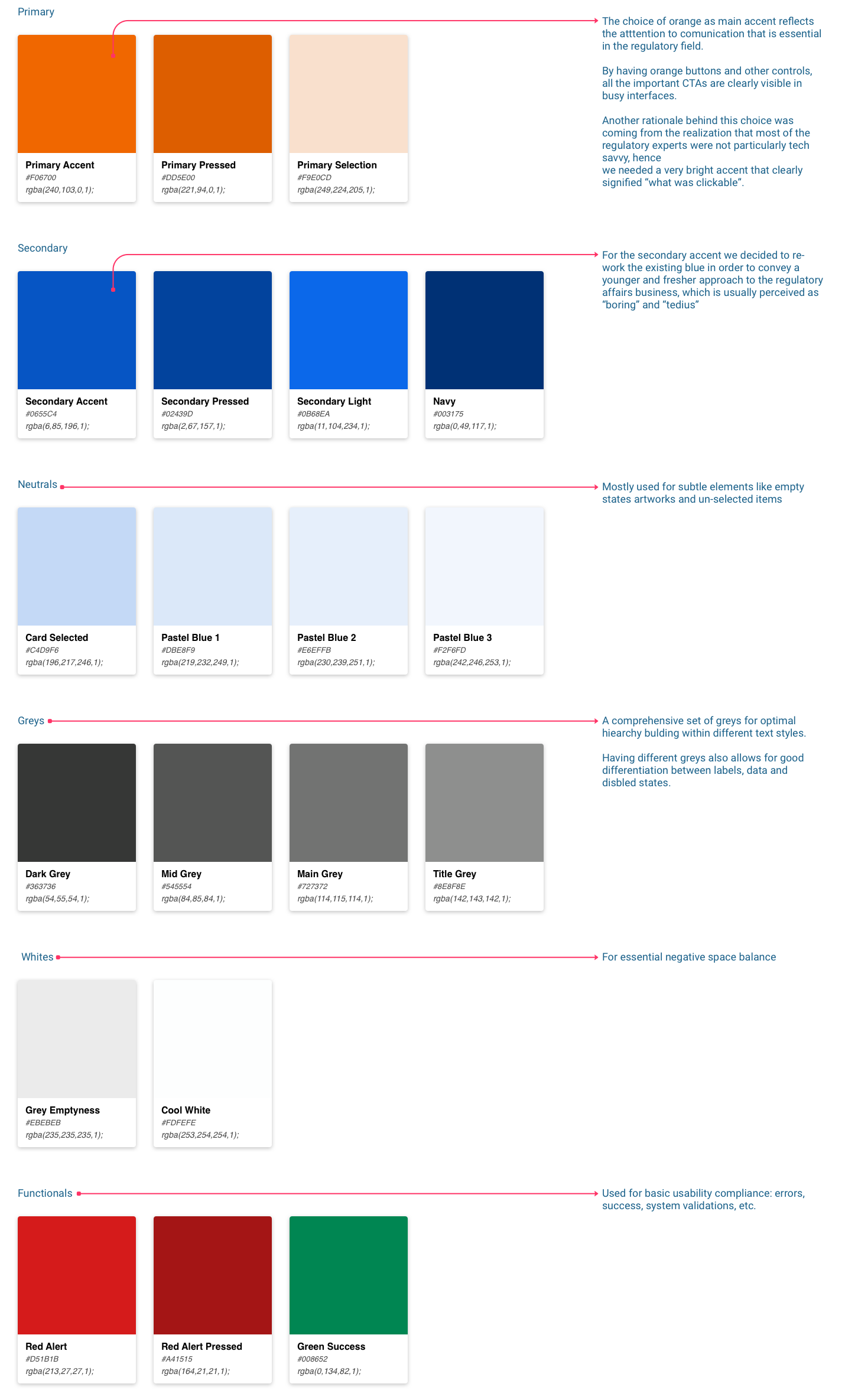
![]() The original logo was quite dull and presented the challenge of deriving an accent color for buttons and other uses. After a few alternatives we opted for a brighter hue of blue (0655C4) that could be used as a secondary accent and replaced the flat green (5BA4A1) with a bright orange (F06700) as primary accent.
The original logo was quite dull and presented the challenge of deriving an accent color for buttons and other uses. After a few alternatives we opted for a brighter hue of blue (0655C4) that could be used as a secondary accent and replaced the flat green (5BA4A1) with a bright orange (F06700) as primary accent.
Color palettes
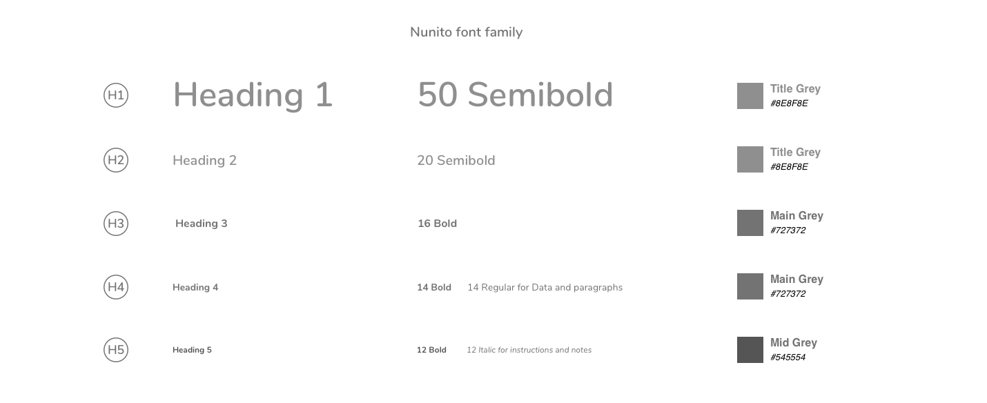
Text Styles
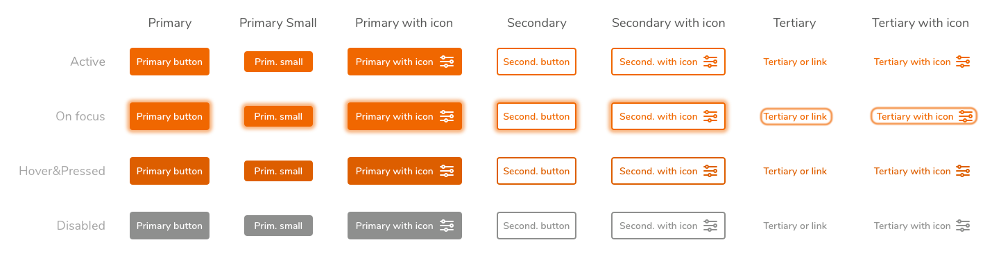
Buttons
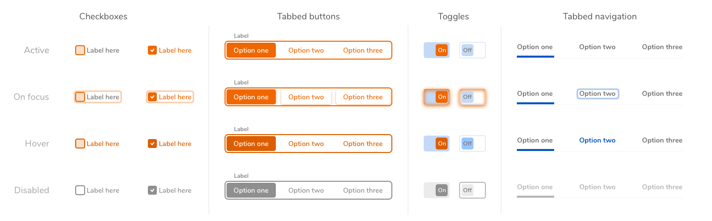
Controls
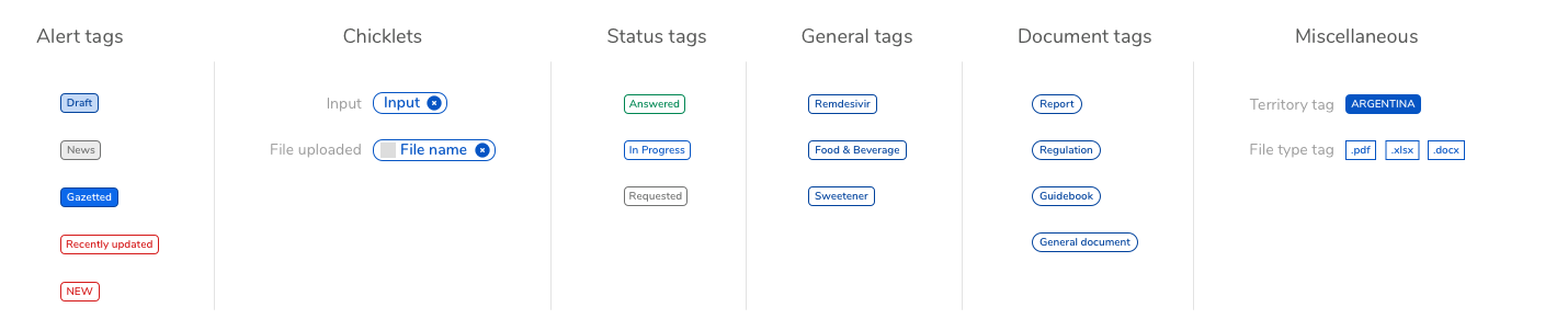
Tags & Chicklets
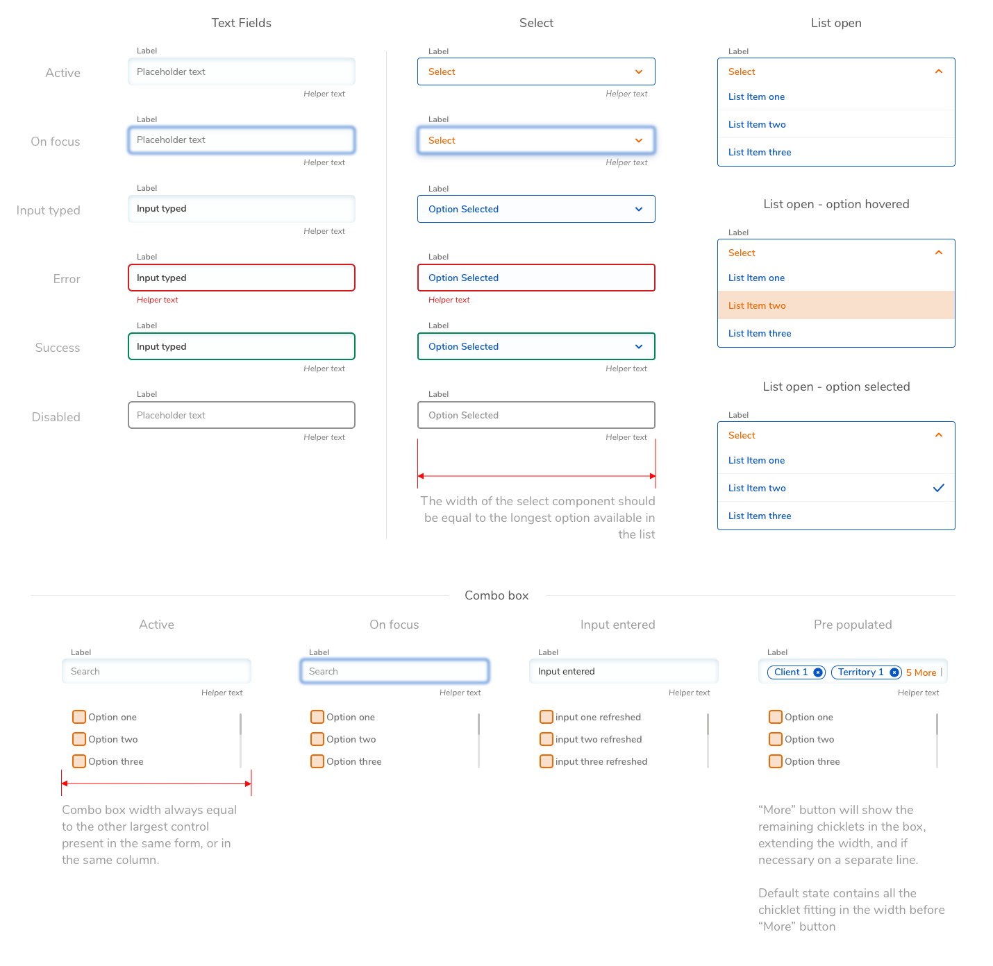
Forms
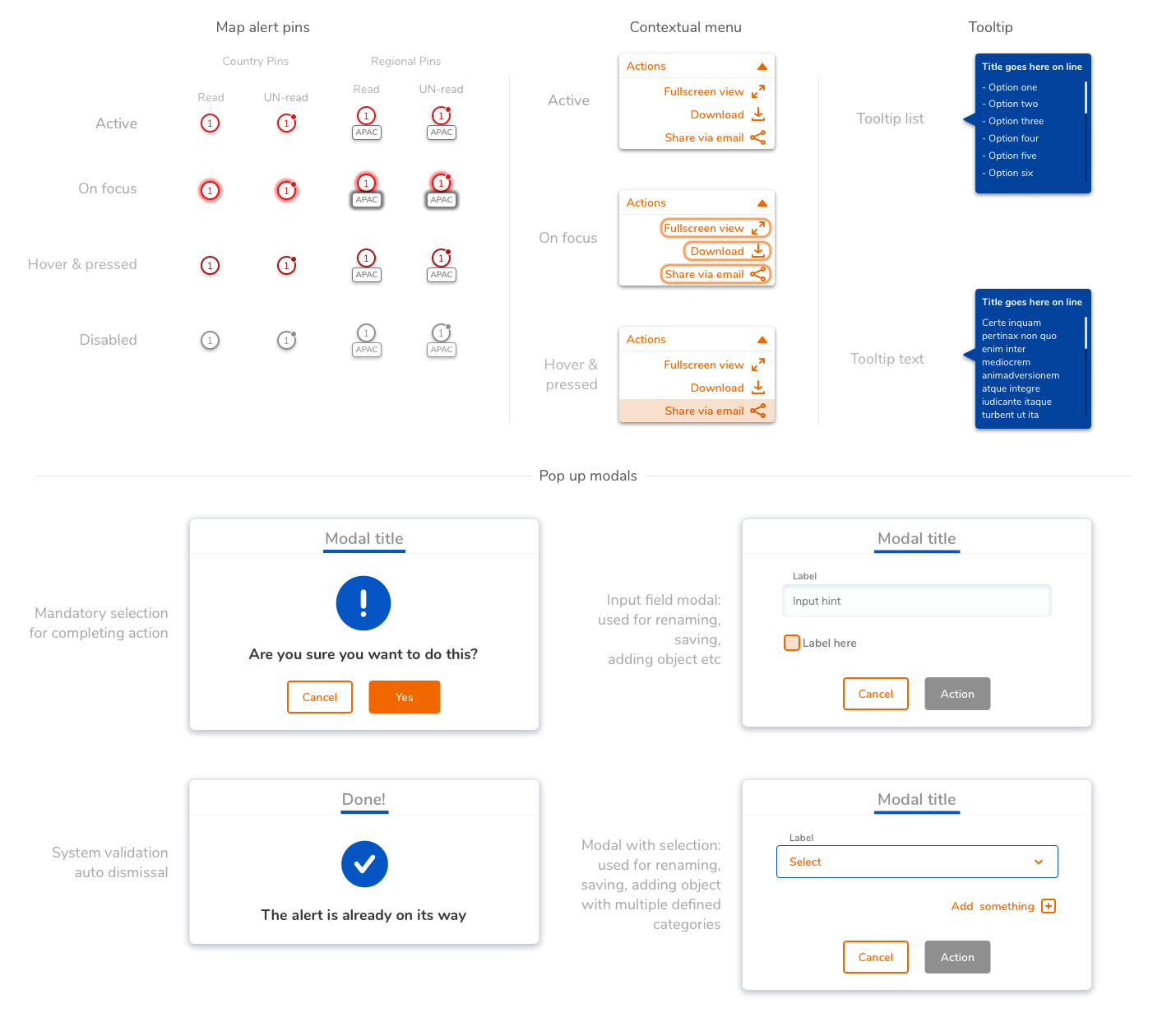
Miscellaneous components
Icons
![]()
Any Design System is by definition a living document and it goes thru continuous iterations of additions and updates. This was the minimum set of components necessary for the product development during the transition from MVP to beta