Context
One of the challenges in the maritime industry operations is to deal with fragmented tasks. Due to old legacy systems, operators have often to juggle between emails, spreadsheets and other platform to complete their tasks. An example is requesting a cargo by freight logistics operators.This use case is getting common among a few shipping companies in the process of digitally transforming their operations. This is a typical case that could be improved by a phone app feature to allow operators requesting a cargo from the palm of their hand.
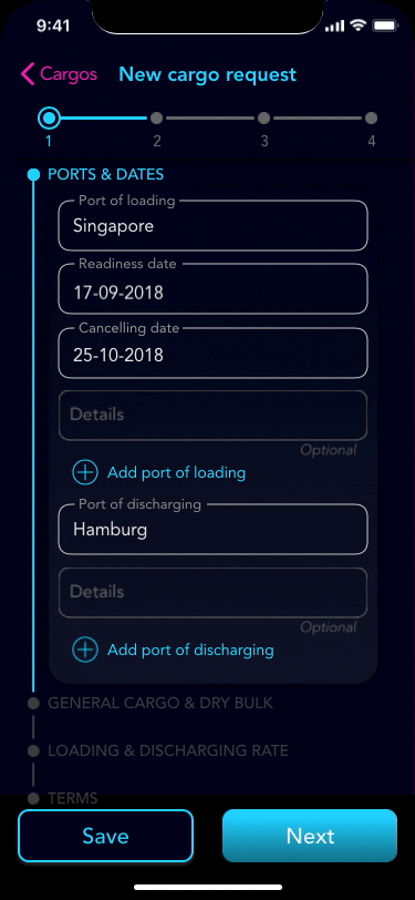
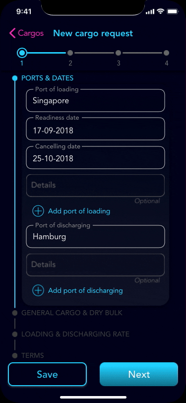
Requesting a cargo is a process which involves completing a form, potentially a long one.
By dividing all the data needed into 4 sections this cumbersome task can become a little more manageable. To improve usability, in these cases, it’s very important to give the user the chance to save their progress and return to this task later on, this is also essential because the operator might not have all the necessary details at hand.
The screens below showcase my take to request a new cargo flow.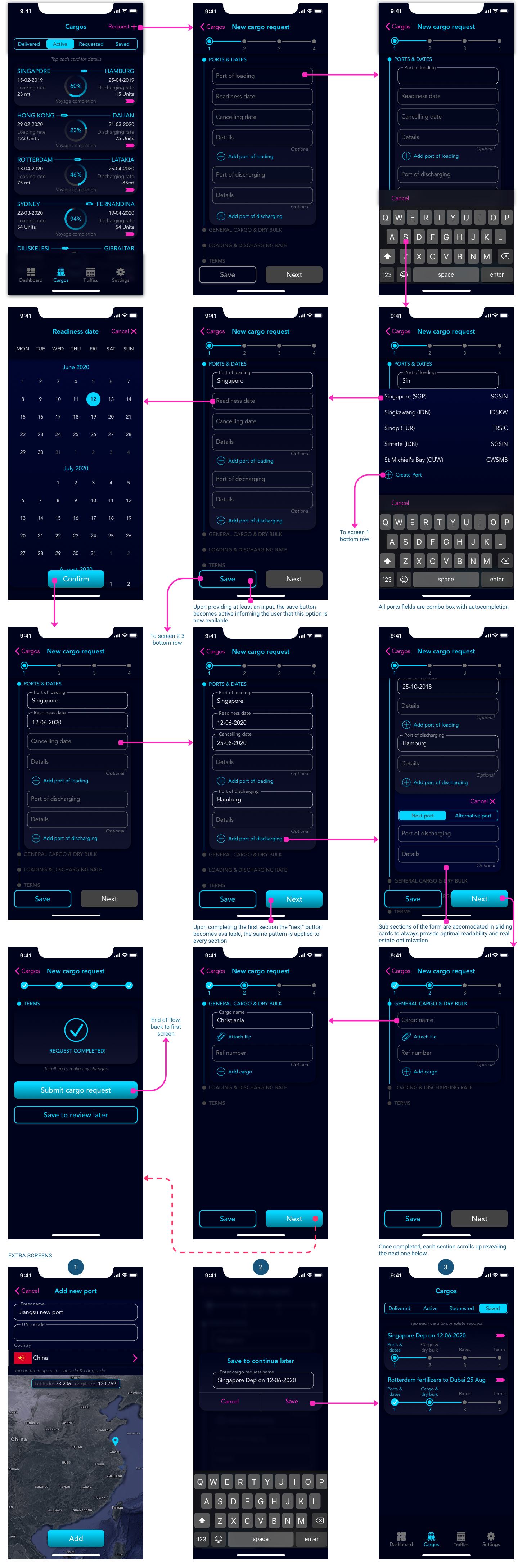 Interactions & Animations
To better understand the main interactions while completing the form, see the gifs below:
Opening a sub-section in the form:
Saving an incomplete request to continue later:
![]()
Completing a section of the form:
Context
Most information dashboards use a three-pronged strategy to establish a sense of control:
1. Giving you a clear understanding of things to help establish a feeling of certainty.
2. Giving you the resources to predict and plan for the future.
3. Helping you complete critical tasks in time to avoid last-minute panic.
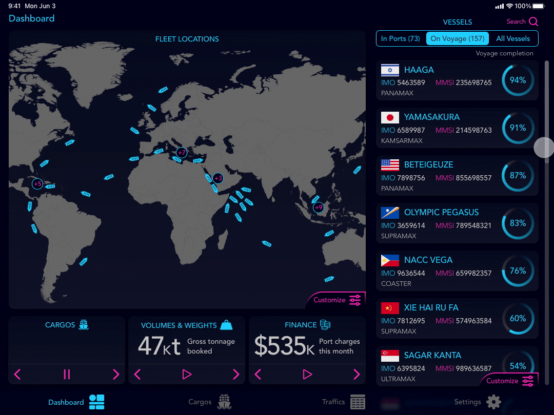
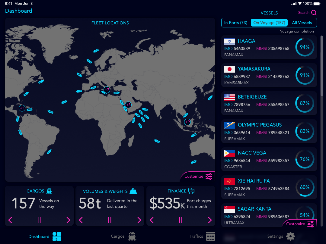
In this context, I designed a dashboard that allows the user to have a broad view of the cargo fleet situation, position on the map, vessel details etc.
Leveraging on the progressive disclosure principle, I decided to limit the information provided to 3 data points at each given time, grouping these into categories using a carousel pattern. The 3 categories are cargos, volumes and weights being transported and the finance involved (essentially costs)
 Interactions & Animations
Dashboard customisations are among the most diffused best practices in UX designs, so I allowed the design to accommodate for a loop carousel or stopping each singular card to show only one data point. See the animation below:
Dashboard chips carousel:
![]()
Another solution to keep a dashboard screen clutter-free and implementing the progressive disclosure principle successfully is to hide extra information, while providing intuitive ways to drill down on areas of interest. In the screen below we can see how much more info a single cargo vessel can have
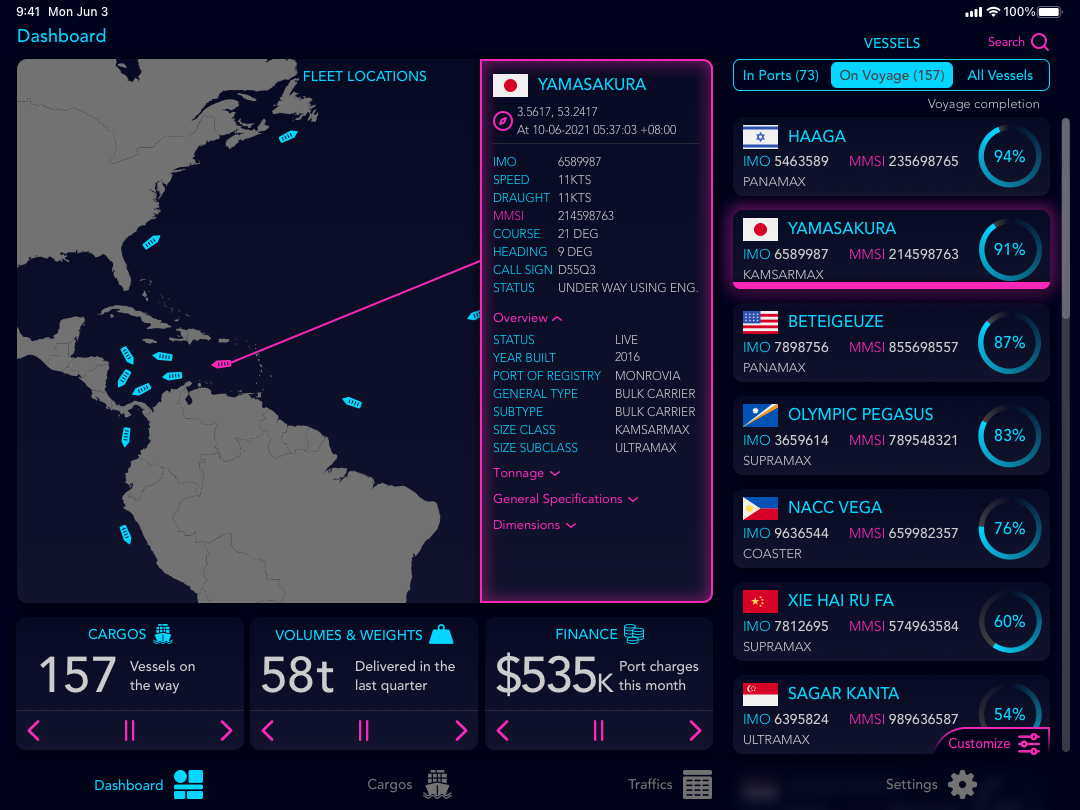
In the animation below we can see how to display the vessel detail by clicking on the card on the right side.
Vessel details reveal: